
Yesterday, the OpenPhone team sent out its first year-in-review email. We wanted to showcase users’ data in a delightful way, so early on in the project we started exploring ways to illustrate that data through dynamic charts.
Here’s the final email for reference:
We decided to use QuickChart as our no/low code tool for creating the charts. It’s essentially a GUI for the chart.js library. For simple charts, you can create a template and pass all of your data through url parameters, or for more complex, data-heavy charts, you can output JSON from the advanced editor and pass it through a webhooks request.
(Shoutout to Claude for helping me make some more advanced changes to the chart settings’ JSON. It was able to ingest what QuickChart generated and modify it really accurately based on my prompt instructions.)
We worked with our data team to build the underlying model, which we passed to customer.io using our reverse ETL tool.
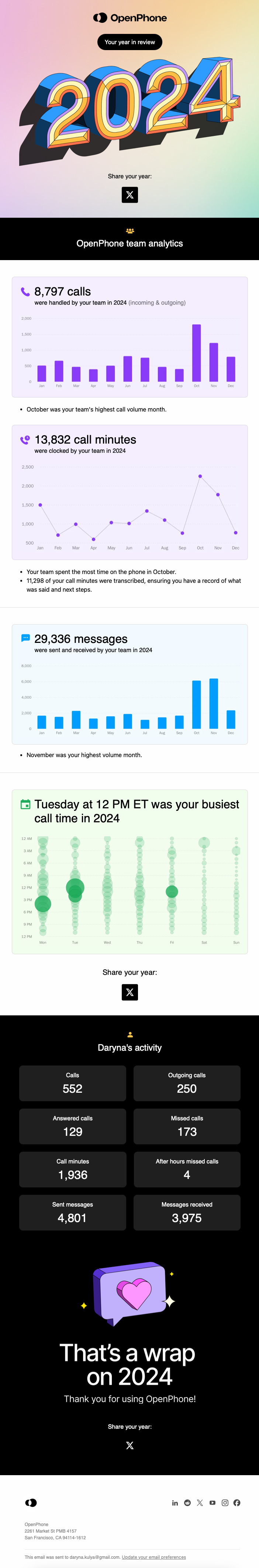
And customer.io’s Parcel editor made it pretty easy to create the email design itself. Here’s what the final campaign looked like:

Each of those webhook requests returns a unique url for that user’s chart, which we store in a customer attribute in order to pass it to the email itself.
A couple other tidbits:
- Quickchart advertises no rate limits on its paid plans, but our charts were rate limited. I’d recommend generating the charts in advance of the email’s send time to reduce the risk from that in the future. You can leave recipients in a “wait until” block or use a separate campaign to generate the charts.
- Some of the data were passed as JSON from our back end, but we couldn’t figure out how to get customer.io to accept that data type as an event attribute, so we had to import it on the customer object.
- Customer.io has a 1kb limit on attributes, which meant we had to break the bubble chart data into multiple attributes in order to work around that limit.